Keith Clancy
Born in the western suburbs of Sydney, Australia in June 1968. Keith studied both Fine Arts and Philosophy from 1986 - 1990 at the University of Sydney graduating with honours in both subjects in 1991.
Selected Critical responses for exhibitions by Keith Clancy
T.J. McNamara reviewing '(T)HERE' for the NZ Herald, Nov 2009
"His work is pure, highly refined abstraction. His paintings are conventional rectangles and each is an iridescent field of colour. His palette is special and highly individual. The intense shades are obtained from colours used in cosmetics and auto-enamels as well as pigments carried in acrylic and vinyl mediums. The effect is an unmistakably modern art of colour and response to light.... (the works) have fascinating properties. The colours change with the light ... and they change as the viewer moves past them... The whole is an almost uniformly successful exhibition responsive to changing light, yet still and meditative."
T.J. McNamara reviewing 'TOUCH' for the NZ Herald, February 2008:
'Every painting is notable for loaded, singularly intense colour.... Some works are simply lovely as "For my Father" with its sombre, deep violet and edging of brown. Both colours change with the light and the movement of the viewer..., all in all this is probably the most brilliant exhibition of abstract art we will see all year."
Dr Elizabeth Grierson, Professor of Art and Philosophy, Head of the School of Art, RMIT art the prize giving ceremony, Walker and Hall Waiheke Art Awards, 25 October 2008:
"This is work of great courage, strong and accomplished. It references colour field an op art in the history of the twentieth century - a Mark Rothko-inspired colour field painting where the intervention of materials makes it a work of 2008. Keith Clancy has taken these modernist references into new territories with his use of contemporary materials and extraordinary command of colour"
T.J. McNamara reviewing "RADIANCE' for the New Zeland Herald, May 2007, Solo exhibition at Compose Art Gallery, Grey Lynn:
"The colours themselves are unusual, at times literally gorgeous. Their intersection is spectacular and the way they shift under the light facinating... This is an exhibition of great accomplishment."
Works by Keith Clancy are held by the James Wallace Arts Trust, Rennie Dowset Architects, Michael Hill and private collections in New Zealand, Australia, New Caledonia, Switzerland and the Netherlands.
Awards
(T)there exhibition 2009
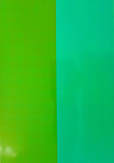
I use recently developed iridescent materials, so-called "interference” pigments, primarily utilised by the cosmetics, automotive, printing and packaging industries. They can be seen on packaging, cars, lipstick and eye shadow but have almost no history in art.
I make "monochromes" which, when seen in natural light and in the flesh are anything but "mono". This is the entire point of the work: simple forms, no drawing, no making pictures but instead allowing an unusual experience to happen.
The colours produced are in fact coloured light not light reflecting off something that is already coloured. These work by the same principle as the colour you see in soap bubbles or butterfly wings - none of those colours are really "there" - it's coloured light.
Any one of my works may feature coloured light and "normal" colours in complex layerings and combinations. My works are radically open to what is outside them, first of all by reflecting the environment in which they are placed and otherwise by changing in response to their placement in space and the movement of the viewer and the angle of light.
Selected Critical responses for exhibitions by Keith Clancy
T.J. McNamara reviewing '(T)HERE' for the NZ Herald, Nov 2009
"His work is pure, highly refined abstraction. His paintings are conventional rectangles and each is an iridescent field of colour. His palette is special and highly individual. The intense shades are obtained from colours used in cosmetics and auto-enamels as well as pigments carried in acrylic and vinyl mediums. The effect is an unmistakably modern art of colour and response to light.... (the works) have fascinating properties. The colours change with the light ... and they change as the viewer moves past them... The whole is an almost uniformly successful exhibition responsive to changing light, yet still and meditative."
T.J. McNamara reviewing 'TOUCH' for the NZ Herald, February 2008:
'Every painting is notable for loaded, singularly intense colour.... Some works are simply lovely as "For my Father" with its sombre, deep violet and edging of brown. Both colours change with the light and the movement of the viewer..., all in all this is probably the most brilliant exhibition of abstract art we will see all year."
Dr Elizabeth Grierson, Professor of Art and Philosophy, Head of the School of Art, RMIT art the prize giving ceremony, Walker and Hall Waiheke Art Awards, 25 October 2008:
"This is work of great courage, strong and accomplished. It references colour field an op art in the history of the twentieth century - a Mark Rothko-inspired colour field painting where the intervention of materials makes it a work of 2008. Keith Clancy has taken these modernist references into new territories with his use of contemporary materials and extraordinary command of colour"
T.J. McNamara reviewing "RADIANCE' for the New Zeland Herald, May 2007, Solo exhibition at Compose Art Gallery, Grey Lynn:
"The colours themselves are unusual, at times literally gorgeous. Their intersection is spectacular and the way they shift under the light facinating... This is an exhibition of great accomplishment."
Works by Keith Clancy are held by the James Wallace Arts Trust, Rennie Dowset Architects, Michael Hill and private collections in New Zealand, Australia, New Caledonia, Switzerland and the Netherlands.
Awards
- Finalist in the Walker & Hall Waiheke Art Awards 2009 with 'Thread'
- Finalist and winner of the Zinni Douglas Award in the Waiheke Art Awards 2008 with 'Lichtung'
- Finalist in the Wallace Art Awards 2008 with 'Chora'
- Finalist and Merit Award winner in the NZ Painting and Printmaking Award 2007 with 'Mirage' (Canonic Variation V)
(T)there exhibition 2009
I use recently developed iridescent materials, so-called "interference” pigments, primarily utilised by the cosmetics, automotive, printing and packaging industries. They can be seen on packaging, cars, lipstick and eye shadow but have almost no history in art.
I make "monochromes" which, when seen in natural light and in the flesh are anything but "mono". This is the entire point of the work: simple forms, no drawing, no making pictures but instead allowing an unusual experience to happen.
The colours produced are in fact coloured light not light reflecting off something that is already coloured. These work by the same principle as the colour you see in soap bubbles or butterfly wings - none of those colours are really "there" - it's coloured light.
Any one of my works may feature coloured light and "normal" colours in complex layerings and combinations. My works are radically open to what is outside them, first of all by reflecting the environment in which they are placed and otherwise by changing in response to their placement in space and the movement of the viewer and the angle of light.